Thursday Travel Photography #4 – Looking for interesting foregrounds in the picture + Image Reviews
This is the fourth in the series of travel photography articles. See earlier articles here.
Last week we looked at how important it is to choose a suitable background while framing the shot. This week, let’s look at introducing interesting foregrounds in the image. Also, let’s look at three images that have been submitted for review this week. If you would like your images reviewed, to know what worked well in the image and how it could have been bettered, post your images on India Travel and Photography group pool on flickr and tag them as itpcritique.
CHOOSING INTERESTING FOREGROUNDS
Sometimes it is easy to get a good picture of your subjects, simply because the subject is so beautiful that you can’t go wrong. Taj Mahal is a good example. Or it could be any well known mountain or a famous waterfall. While your photograph would be just fine by itself, it may not stand out or not have any personal memories etched into the image, simply because it is just one a million shots that get taken every day. Your picture of Taj Mahal would be exactly same as the ubiquitous image taken by hundreds of people who visit the Taj, and published many times over.
A great way to pep up such images is to add some interesting foregrounds to it. The choice of foreground has to be made wisely and it must fill in just the amount frame not to distract the viewer from the main subject. Let’s look at a few examples.
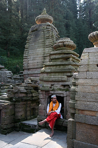
The subject of the picture here is the tall ancient temples from the small village of Jageshwar in Uttarakhand. Having taken a few images of the temples already, I was looking for something that can fill life to the image. That’s when I spotted this priest sitting on the steps in front of one of the shrines. He added a lot of interestingness and life to the image of the temples.
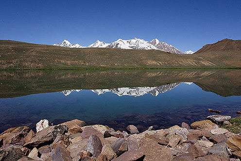
However beautiful Chandratal Lake is, I found it hard to get good images of the lake. It is a vast lake, and letting the clear lake to occupy bulk of the frame did not work very well. Its surface was very calm and reflected the sky and the mountains so well that the lake surface itself could not be seen. That’s when I thought of adding the stones in the foreground. This is what I finally got.
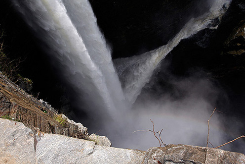
The scale and magnificence of Jog Waterfall would never have been apparent, had I not bothered to include a little bit of the cliff at the bottom of the frame. In fact, picture of the just the strands of waterfall would have left the viewer clueless about what is happening. The foreground also helps get the perspective right, and sometimes gives a sense of scale.
I stumbled on this image yesterday browsing through flickr, which would be a perfect example of using a foreground to enhance the image. The plant in the foreground by itself is not interesting, but greatly enhances the photograph as a whole.
To conclude, there are various ways by which a good foreground can improve the image. It could create a distraction that actually complements the image and makes it stand out from the typical. It can also make the viewer realize the scale, and help in getting the right perspective.
IMAGE REVIEWS
The two images below are posted for review by flickr users Prashanth M‘ and mridula respectively.
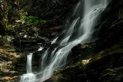
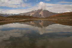
Both images are good subjects for introducing a foreground to enhance the image. While Prashanth M‘s frozen waterfall is well executed, something more to fill the bottom right portion would have improved the image. Normally, a flow looks pleasing to the eye when it moves from left to right than otherwise, but I guess such an angle would not have been possible with this waterfall. The image of lake submitted by mridula has nice reflection, and the mountains are positioned well in the image. But looking at the picture, I can’t tell how much does the lake extend to the front, and miss the scale of the entire lake. The piece of cloud sticking right on the mountain peak is also a distraction. Waiting for it to go away would have helped.
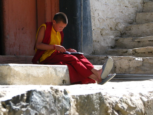
Though I was planning to review just two pictures, I could not resist posting this one, submitted by flickr user janhaviiii. A well executed image, the young monk is positioned perfectly well in the frame. The porch where he is sitting, steps leading up, the free space left in front of the monk are all that go well with the picture. The bottom portion of the image is unfortunately burnt, and is very prominent. But with the monk sitting in shadow and too much variance of brightness in the frame, this would not have been easy to prevent. One possibility to get this right would be to slightly underexpose the shot, and brighten the shadows later on the computer.
If you would like your images reviewed and know what worked well in the image and how it could have been bettered, post your images on India Travel and Photography group pool on flickr and tag them as itpcritique.
