Thursday Travel Photography: Remember to Crop the Picture
In today’s Thursday Travel Photography column I am going to talk about cropping. The second part of this article has weekly image reviews. If you would like to have your images reviewed to know what worked well and how it could have been improved, choose some of your best images and post them on group pool of India Travel and Photography. Don’t forget to tag them as itpcritique, so they can be chosen for review. You can also post your questions related to photography as a comment to this post, or in India Travel and Photography group discussion. I will answer them in next week’s article.
CROPPING
The camera sensor or a frame of film has a fixed dimension. However, the image you have in mind may not always fit in those dimensions very well. Consciously or unconsciously, we tend to live with the picture that we have got from the camera. Sometimes, getting rid of unwanted part of an image can enhance it by a great deal. A tasteful cropping may improve the aesthetics of the image, but in many occasions, it is simply a practical tool that doesn’t demand much intelligence or an artist’s eye. You can just eliminate parts of a flat sky on the top, a disturbance in a corner or an element that doesn’t fit well with rest of the frame.
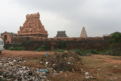
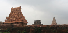
This is very straightforward when you look at the examples below. The picture of Thanjavur Temple and the cropping speaks for itself and needs no explanation.


Let’s look at it in some more detail. Why did I even include the garbage in the first place? Small elements may creep in unnoticed in a picture. But here, that is obviously not the case. I could have recomposed the shot by removing the lower part and including the sky instead. But there are two reasons for not doing so.
First, the cropped image to the right is how I conceived my picture irrespective of what the camera would capture. Be it sky or the ground, I was going to crop that excess anyway. Second, I chose to include ground instead of the sky, as it would allow me to hold the camera horizontally. Including more of the sky instead would need tilting the camera vertically, and would have resulted in a distortion, making the towers look converging. Allowing the garbage to seep into the frame and cropping it later was the easy choice.
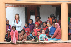
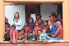
In many occasions, choice of cropping is not necessarily so obvious. In the picture below, where people are intensely watching a cham dance performance in a monastery in Ladakh, there are no obvious eyesores similar to the above image. However, getting rid of the portion beyond the right pillar helps create a neat and good looking frame, and removes a distraction in the picture. Also note that I got rid of the cable hanging on the top.


There are several such occasions when cropping can help. Here is a quick list.
1. When there are unwanted elements in the image, like the garbage in the picture of Thanjavur Temple.
2. To provide a neat uniform look to the image by removing any distraction, like in the second example above.
3. To get rid of too much of bland elements that may not add value to the image, such as a very plain sky.
4. To emphasize your subject subject and keep the viewer focused on it. For example, if you are shooting a particular building, you could crop any neighbouring buildings that sneak into the frame, if you can’t avoid them at the time of framing.
5. To remove technical errors that may crop up in the image. For example, wide angle lenses may produce images that are slightly skewed at the edges.
Cropping helps you to overcome the physical limitation created by the size of the sensor. I would advise having a cropping in mind at the time shooting, like I had with the picture of Thanjavur Temple, than try to look for a crop at a later point of time.
IMAGE REVIEWS
The image below is posted for review by flickr user mallumax
Flowers rarely fail to make good choice of subject. Same applies to this too, and focusing on just a part of the flower usually works well. The simplest way this image could have been improved was to shoot it against a clutter free background. A completely green background would have easily made the subject stand out in against background. My earlier article in the thursday-travel-photography series on backgrounds gives a better idea of how a uniform background makes a lot of difference to the image, and ways to achieve background blur.
If you would like to have your images reviewed to know what worked well and how it could have been improved, choose some of your best images, post them on group pool of India Travel and Photography and tag them as itpcritique. Only tagged images are taken for reviewing. You can also post your questions related to photography as a comment to this post or in India Travel and Photography group discussion. I will answer them in next week’s article.
