Travel Photography: The Human Element
A version of this article appeared in April issue of Terrascape, a travel magazine where I write a column on photography.
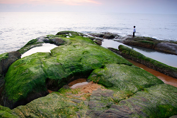
Whether you are taking pictures of a magnificent landscape, a large beautiful monument or scenes from every day life, a human element carefully included in the frame can make a great difference to the image. You would have seen photographs of gorgeous mountainous landscapes with just a silhouette of a man waving from the top of a hill or edge of a cliff. As your eyes move around the picture admiring the beautiful landscape, they eventually settle on the human figure that makes the viewer realize the scale and might of the scenery.
When you include a human factor in just the right part of the frame, it adds considerable value to the photograph. Listed here are some tips of how to do it.
Find a strategic location to place a person. Don’t make it an obvious image of someone posing in front of the camera with the subject behind the person. For example, it would be worthwhile having someone walking away in the last bend when you are photographing a winding road. Get someone colourfully dressed to look out from the middle floor of a tall monument. Get the picture of someone climbing halfway up or standing on the summit of a tall hill.

Allocate only a small part of the frame. This helps the viewer to understand the scale and significance of the object against the person in the image. Allocating anything more than 10% of the frame to a person makes the human element dominate much more than the scenery and spoils the effect. It is best if the person is small enough not to be recognized easily.
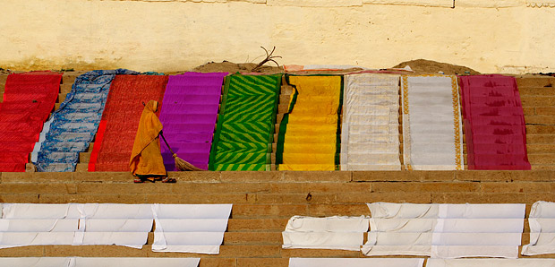
Show some activity. It helps to have a person performing a task that blends with the environment. A climber is best shown trying to make his way up with all the necessary gear tied to his body. The picture of the Ghats of Varanasi shown here with someone sweeping the steps blends well with the atmosphere than having someone standing idle.

Show contrast in the image. Some one wearing a red coloured dress is likely to stand out well in a snowy landscape. A white dress will do excellent job in an expanse of sand dunes.
Position your subject off-center. It is more pleasing to the eye to have your subject slightly away from the center. Use the popular rule of thirds: if you slice the frame into three parts horizontally and vertically by drawing two horizontal and vertical lines each, the four intersections of the lines provide ideal position in the frame to place your subject.
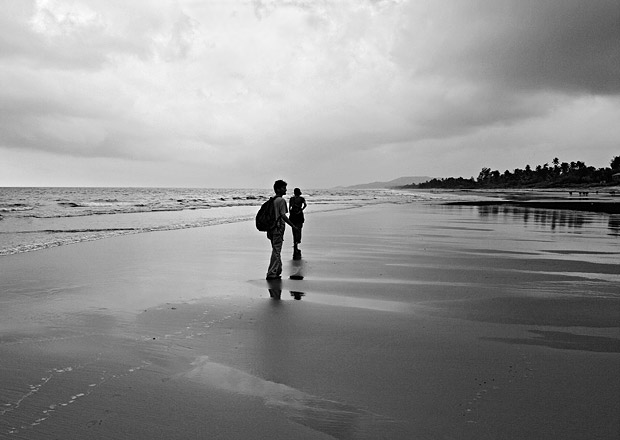
Go black and white. Black and white images work best when there is a lot of contrast, such as an occasion when there is a variation of light and shadows in a frame. Black and white comes to the rescue in times like mid-day or cloudy skies when colours tend to get rendered washed out. The high contrast between sky and the ground and the gentle lines leading out of the subjects made the picture below a perfect candidate for black and white conversion.

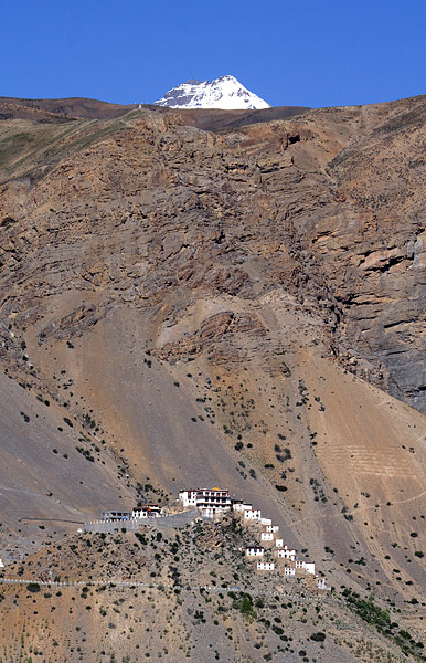
It doesn’t have to be people. The human element doesn’t have to mean people all the time. A building in the middle of the mountain, a ship in the sea, a colourful house in a vast meadow or such structures that provide a sudden distraction in a natural setup can also have a great impact on the viewer.
