Today’s edition of Thursday Travel Photography is intended to help you understand what makes an image a technically poor one. Obviously, a good(and easy) way to make better pictures is to first eliminate the negatives.
The second part of this article has weekly image reviews. If you would like to have your images reviewed to know what worked well and how it could have been improved, choose some of your best images and post them on group pool of India Travel and Photography. Don’t forget to tag them as itpcritique, so they can be chosen for review. You can also post your questions related to photography as a comment to this post, or in India Travel and Photography group discussion. I will answer them in next week’s article.
TECHNICALLY BAD IMAGES
Just a small number of parameters define the technical quality of an image, which can be easily understood even by the most amateur photographer. And once understood, a constant watch at these parameters can help make improvements in the pictures. Here is a list.
1. Exposure – dark, burned areas, etc
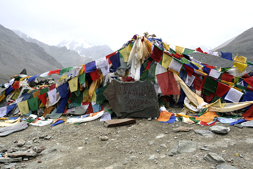
When there is too much contrast in the frame you are shooting, it is very likely that some areas of the image get exposed badly. For example, if you are shooting a building when the sun is high, you might see that the sky may appear fully white in your picture, even if you have had a blue sky. Similarly if you have a reflecting metal surface in the frame when you are shooting indoors, the areas of the reflecting surface may appear completely white in the image. Look at the example below.

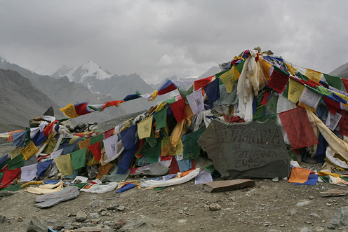
The prayer flags are looking fine in the image, but the sky is completely white, or burnt, as it is often called. Burnt areas usually make an ugly sight in a picture. The image would look considerably better if the details of the sky were visible properly. See the picture below, which was exposed correctly. As you can see below, the clouds are seen clearly and so are the peaks of the distant mountains.

The reverse also can happen, where most of the image is exposed properly but some parts have turned out completely dark. Taking the example of a building in the afternoon sky, or when the sun is right behind the building, you may also end up with just a silhouette of the building with no details visible. Either way, it makes a technically bad image. Unless ofcourse your intention was just to get the outline of the building.
2. Sharpness – camera shake and out-of-focus images
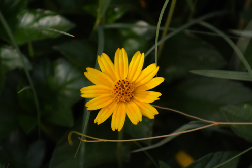
Camera shake is one of the biggest problem in photography, especially if you are shooting indoors. The image may look fine on the LCD, but camera shake may become obvious when you see the full size image on the monitor. Sometimes it is not evident, but the overall image quality will not be as good as it should be even if there is slightest shake in the image. Look for ghost shadows in the edges to determine if the image is perfectly sharp. More sharp the image, more pleasing it is likely to appear to the viewer.
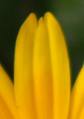
The image below may appear sharp enough even when you see it in full size. But if you look carefully, you can see a yellow ghost line at the right edge of the petal at the blow-up of the image below.


The culprit here is camera shake. Such faults may not appear significant, but they make a lot of difference to the quality of the image.
In a similar way, an image where the subject has gone even slightly out of focus also affects the sharpness, and hence the quality of the image. Always check the image carefully in full size.
3. Other blemishes – sensor dust and chromatic aberration.
Sensor dust is a problem in DSLRs if you frequently keep changing lenses. It can cause black patches in the picture, which is more evident in images that have lot of sky in the frame. To check for sensor dust in the your camera, take a picture of plain sky on a bright day and see if there are any dark patches in the image. Get is cleaned at your camera service center.
Chromatic aberration (CA) is a phenomenon where you see purple or cyan bands along the edges where contrast is very high. This is a problem created by poor lens quality. Look at the example below. These bands appears only when the contrast in the picture is very high(such as backlit images). Expensive lenses tend to be better at handling such situations, but it is hard to avoid them in cheaper kit lenses in situations where there is too much variation in light.

If you are seeing too much CA with your lens, avoid shooting where the background light is too strong.
Another lens related problem is called vignetting, usually seen in wide angles lenses. It is a phenomenon where the corners of the images appear darker compared to rest of the image. It can happen in ultra wide-angle lenses, where the lens edges or mounted filters may block some light entering into the lens. Remove any filters on the lens if you notice this problem.
Some of these problems are related to the devices(camera/lens) you are using, and in such cases there is no easy solution to the problem. A steady hand or tripod can fix camera shake. Read my earlier article on holding the camera steady. To correct dark or burnt areas requires exposure compensation (more on this in future articles).
IMAGE REVIEWS
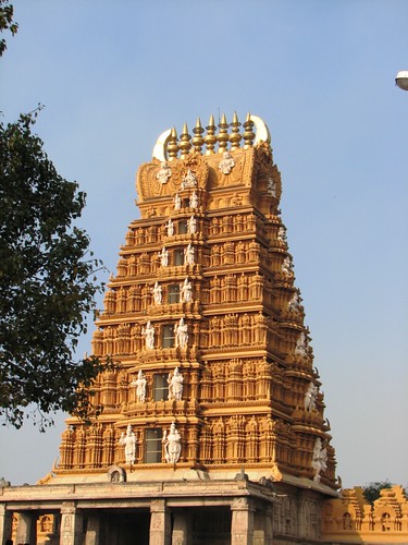
The image below is posted by flickr user vdeepu

I can’t find much fault in this picture. The lighting here is good – sky and the temple are exposed properly. The image also looks sharp. But to me, it also looks a bit dull and more like a documentary image showing something as it is. I do not know how the surroundings of the temple look like, but if there was some element of life, or if there was was more to it that depicted the tower against its environment, the picture would appear more enriched. It would also work well if the Gopura was framed within another frame(such as pillars of a mantapa). Or another possible option would be to stand under a tree and have some hanging leaves on the top of the frame. These are just some possibilities. More such options would exisit and is best decided on location, depending on the environment. Including the atmosphere around the tower helps provide a context to the viewer, and gives a better outlook of the atmosphere. The lamp in the top-right that has sneaked into the frame can be avoided.
If you would like to have your images reviewed to know what worked well and how it could have been improved, choose some of your best images, post them on group pool of India Travel and Photography and tag them as itpcritique. Only tagged images are taken for reviewing. You can also post your questions related to photography as a comment to this post or in India Travel and Photography group discussion. I will answer them in next week’s article.
In this instalment of Thursday Travel Photography, let’s talk about the good old secret of getting better at things – to keep trying.
The second part of this article has weekly image reviews. If you would like to have your images reviewed to know what worked well and how it could have been improved, choose some of your best images and post them on group pool of India Travel and Photography. Don’t forget to tag them as itpcritique, so they can be chosen for review. You can also post your questions related to photography as a comment to this post, or in India Travel and Photography group discussion. I will answer them in next week’s article.
KEEP GOING BACK
There are many occasions when I have been to a beautiful place, but came back without pictures that reflect its beauty. The reasons could be many. It could be bad weather, or that I may not have had enough time to get a good shot, or that I simply may not have managed a good composition of the subject. Whatever be the reason, it pays to keep trying.
The most important rule about trying again and again is to choose a subject or location that is easily accessible. It is obviously impossible to keep going back an exotic location in a faraway place. A better choice would be a hillock outside the town or a pretty place that makes a good weekend drive. It pays to choose one of your favourite places where you always look forward to return to.
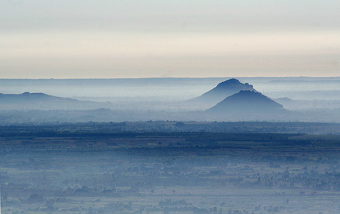
Looking at my own images, I can’t help but see that some of my favourite images were shot after repeated visits to the same location, trying again and again to find a good picture or a good composition. A good example is Nandi Hills, where I might have gone nearly a dozen times but had not made it back with images worth recalling. But last winter, in yet another photo-trip to the hill, I finally had a shot that I felt good about.

A picture of Nandi Hills last winter. Despite many visits earlier, this is a perspective that had never occurred to me. The weather also worked in my favour that day.
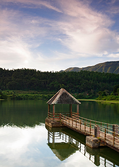
The same applies to the picture of Hirekolale Lake below, which was taken in my third visit to the place.

In my first visit to this lake, I hardly managed a decent picture. In the second visit, I more or less had this composition in my mind, but the weather was not in my favour. Everything fell in place for the picture in the third trip.
The good thing about returning to the same place is that you often know what doesn’t work well. You have already worked on the location earlier, and have many wasted compositions that you already know about. It helps you to explore new things, push to your limits and go and experiment more possibilities. It helps you find new perspectives.
Besides that, repeated visits may help you see the place in various weathers and moods. For example, Nandi Hills tends to be flat and bland even in early hours of the morning during summer. During the monsoons, it stays wet and foggy till 10am or even later, and the perspective you get is completely different. Visibility drops down to a few meters, and the views of the neighbouring hills just don’t exist. In winter, low lying fog or layers of clouds create a completely different kind of magic. The more you visit, more variations of these moods you will find. More familiar you are with the place, more new things you will discover, and better images you will come out with.It is important to keep going back instead of being done with the place in the first visit.
I remember coming back unsatisfied from my last visit to Badami, unhappy that I could not do justice to the beauty of the place with the camera. Most of my time there was spent seeing and discovering, leaving me little time to work on photography. I intend to get back there again in a month or two when the monsoon is at its best. This time, I have a few thoughts already etched in my mind about the locations and compositions. And as I wander the hills of Badami trying to execute those composition, my mind will also be working on new possibilities for another visit. It could very happen that I may not make good images even in my second visit. But that only helps me make plans for my third trip.
No place will be exhausted easily, and the more visits you make, more mature are your images going to get.
IMAGE REVIEWS
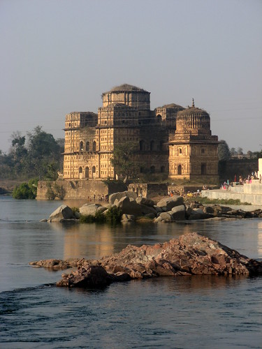
The image below is posted for review by flickr user paandu

I can hardly find any faults in this beautiful picture from Orchha. The river looks clear and nice, and the structure looks pretty too. The composition looks neat, with some interesting foreground. The main subject gets its due prominence. The morning light is slightly warm(yellowish) and adds a nice tone to the colour of the building. Shadows cast by the light on the building and the rocks are not harsh. There is little to complain about in the image. I wish the cables in front of the building did not exist, but I can’t see a way around it either. I can only think of a small improvement in the image by composing it a little tight, zooming in a little more towards the subject. You can see my choice of crop by going to the flickr page for the image and hovering the mouse on the image.
If you would like to have your images reviewed to know what worked well and how it could have been improved, choose some of your best images, post them on group pool of India Travel and Photography and tag them as itpcritique. Only tagged images are taken for reviewing. You can also post your questions related to photography as a comment to this post or in India Travel and Photography group discussion. I will answer them in next week’s article.
In today’s Thursday Travel Photography column I am going to talk about cropping. The second part of this article has weekly image reviews. If you would like to have your images reviewed to know what worked well and how it could have been improved, choose some of your best images and post them on group pool of India Travel and Photography. Don’t forget to tag them as itpcritique, so they can be chosen for review. You can also post your questions related to photography as a comment to this post, or in India Travel and Photography group discussion. I will answer them in next week’s article.
CROPPING
The camera sensor or a frame of film has a fixed dimension. However, the image you have in mind may not always fit in those dimensions very well. Consciously or unconsciously, we tend to live with the picture that we have got from the camera. Sometimes, getting rid of unwanted part of an image can enhance it by a great deal. A tasteful cropping may improve the aesthetics of the image, but in many occasions, it is simply a practical tool that doesn’t demand much intelligence or an artist’s eye. You can just eliminate parts of a flat sky on the top, a disturbance in a corner or an element that doesn’t fit well with rest of the frame.
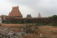
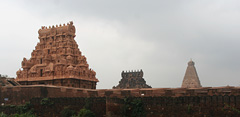
This is very straightforward when you look at the examples below. The picture of Thanjavur Temple and the cropping speaks for itself and needs no explanation.


Let’s look at it in some more detail. Why did I even include the garbage in the first place? Small elements may creep in unnoticed in a picture. But here, that is obviously not the case. I could have recomposed the shot by removing the lower part and including the sky instead. But there are two reasons for not doing so.
First, the cropped image to the right is how I conceived my picture irrespective of what the camera would capture. Be it sky or the ground, I was going to crop that excess anyway. Second, I chose to include ground instead of the sky, as it would allow me to hold the camera horizontally. Including more of the sky instead would need tilting the camera vertically, and would have resulted in a distortion, making the towers look converging. Allowing the garbage to seep into the frame and cropping it later was the easy choice.
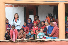
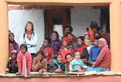
In many occasions, choice of cropping is not necessarily so obvious. In the picture below, where people are intensely watching a cham dance performance in a monastery in Ladakh, there are no obvious eyesores similar to the above image. However, getting rid of the portion beyond the right pillar helps create a neat and good looking frame, and removes a distraction in the picture. Also note that I got rid of the cable hanging on the top.


There are several such occasions when cropping can help. Here is a quick list.
1. When there are unwanted elements in the image, like the garbage in the picture of Thanjavur Temple.
2. To provide a neat uniform look to the image by removing any distraction, like in the second example above.
3. To get rid of too much of bland elements that may not add value to the image, such as a very plain sky.
4. To emphasize your subject subject and keep the viewer focused on it. For example, if you are shooting a particular building, you could crop any neighbouring buildings that sneak into the frame, if you can’t avoid them at the time of framing.
5. To remove technical errors that may crop up in the image. For example, wide angle lenses may produce images that are slightly skewed at the edges.
Cropping helps you to overcome the physical limitation created by the size of the sensor. I would advise having a cropping in mind at the time shooting, like I had with the picture of Thanjavur Temple, than try to look for a crop at a later point of time.
IMAGE REVIEWS
The image below is posted for review by flickr user mallumax

Flowers rarely fail to make good choice of subject. Same applies to this too, and focusing on just a part of the flower usually works well. The simplest way this image could have been improved was to shoot it against a clutter free background. A completely green background would have easily made the subject stand out in against background. My earlier article in the thursday-travel-photography series on backgrounds gives a better idea of how a uniform background makes a lot of difference to the image, and ways to achieve background blur.
If you would like to have your images reviewed to know what worked well and how it could have been improved, choose some of your best images, post them on group pool of India Travel and Photography and tag them as itpcritique. Only tagged images are taken for reviewing. You can also post your questions related to photography as a comment to this post or in India Travel and Photography group discussion. I will answer them in next week’s article.
